
3rd place in Penguin Random House Design Awards
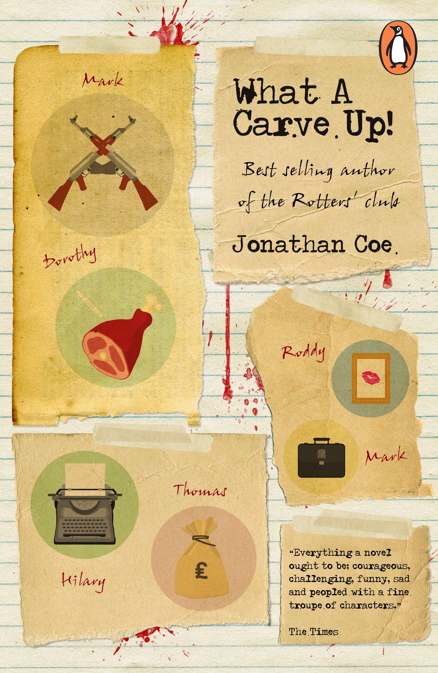
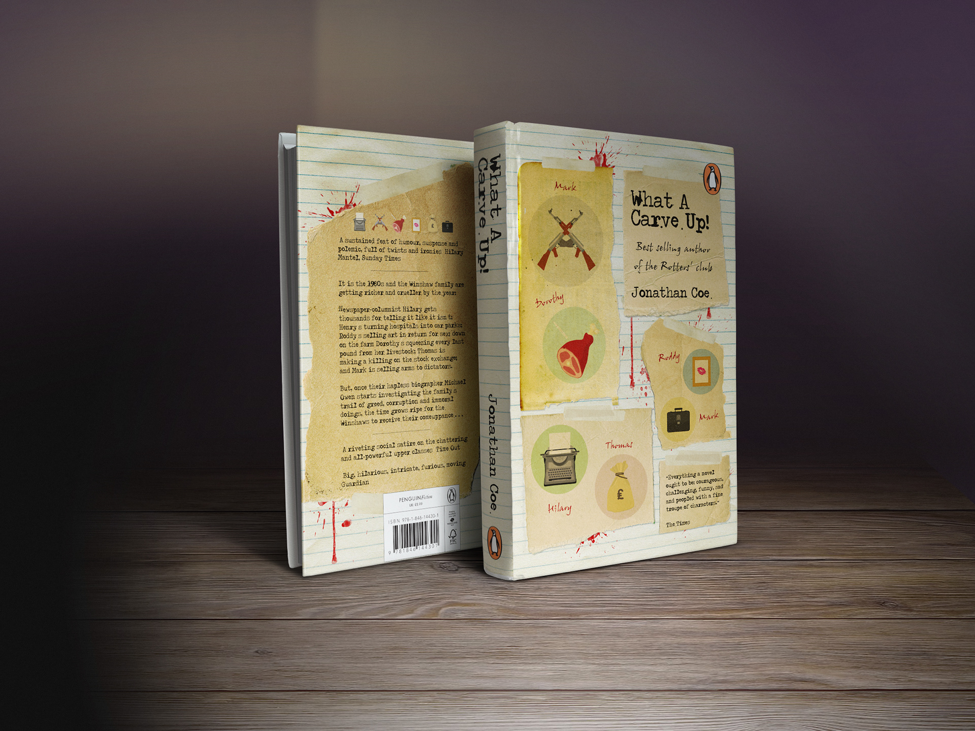
The brief asked us to redesign the cover for Jonathan Coe’s What A Carve Up! novel. The cover should reflect the richness of Jonathan Coe’s writing to appeal to a contemporary, discerning, literary readership.
After a thorough analysis of What A Carve Up! I decided to focus my design on the mysterious investigation that the multi-dimensional character Michael Owen undertook. In order to do this I depicted imagery from his investigative notebook, revealing a snippet of information for each member of the Winshaw family, carved up into sections. I wanted to emphasise the time period the book was set in through the use of typography and visual imagery, whilst at the same time infuse a more contemporary style of illustration. Each icon represents the certain employment sectors that each character manipulated.


Judges Comments
"Across-the-board a great cover – front, spine and back. The sense of a complete design working as a whole is confidently achieved" Rob Ryan
"A very accomplished cover which draws you in to the narrative strands of the book. Great use of space, layout and typography" Petra Börner
"Complete package – considered type, lovely illustration carried throughout the whole front, spine and back cover’"
John Hamilton – Art Director, Penguin General
"We liked the illustrations and also felt the type was very strong. It suggests narrative in an intriguing way. It’s well balanced, clear and attractive" Joanna Prior – Managing Director, Penguin General
"This design is to a very high quality. Great details that explain the story without being too busy – very well balanced"
Jim Stoddart – Art Director, Penguin Press